For
the past several months, Marco Tomaschett, the coordinator of the new Fine and
Vintage Writing Instruments Department at Swann Auction Galleries, and I have
been assembling and cataloging our inaugural sale of fine and vintage writing
instruments. With that complete, now comes the fun part, creating the
visuals and assembling the sale as presented in the online and paper
catalogues.
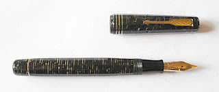
We
thought that you might like to see at least part of that process as we
photographed the pens in our New York galleries during the third week of
July. The photography was done by
Brilliant Graphics, the photographer Peter Philbin, assisted by Pete and
Christa, whose surnames I did not get. Thos involved from Swann were me, department coordinator Marco Tomaschett and art director Bette Rothstein.
For me, since I photograph pens for my
own website, it was fascinating to see how the pros work, using lighting and
shadow so carefully and the extent to which post production processing is part
of the process. So here goes.

This is the studio that Brilliant set up in our downstairs gallery. It
looks primitive, but I would learn that it's all in the skill of the
photographers

 Marco and Bette conferring over the "book" of shots to be styled.
Here is some of the property as we began to stage it.


The computer allows the photographers to instantly check their work on a large screen and then correct images. This was less important for the production shots which were a matter of placing and shooting than the styled shots that came afterward.


 This is how the shot turned out.
 Below, Peter, Christa and Pete analyse and correct.


In truth, the process takes time and oftenwe were standing and sitting around. Pet and Christa, being the artists they are, found some creative use for the mounting putty we used to hold pens and props in place.


Comments
Did the photographers come with a selection of backgrounds like the manuscript, or did they find them afterwards after reviewing the pens?